7 Types of bottom Navigation Bars in Mobile Apps
Introduction:
A bottom navigation bar is a graphical user interface component found in many mobile apps. It provides quick access to commonly used features or destinations within an app. The bottom navigation bar typically contains a set of three to five items represented by icons. When a user taps on one of the items, they are taken to the associated screen. Bottom navigation bars are most useful in apps that have a limited number of top-level destinations, such as a newsreader app, a social media app, a shopping app, etc...
Anatomy of navigation bar
The navigation bar is a crucial element of both web and app design. Its various parts - such as the container, inactive icon, inactive text label, active icon, and active text label - all work together to create a seamless experience for users.
Icons with color opacity
Your bottom navigation bar should always include an icon, and you should choose a fill color for your active bar. To make your inactive icons more visible, reduce their opacity to around 40-50%.
Icons with text label
Text labels provide short, meaningful descriptions of bottom navigation destinations. It's best to pair icons with text labels, especially if the icon doesn't have an obvious meaning.
icons with underline
This is another kind of bottom navigation bar Where an icon is added with the visual underline.
Icons with background
Add a background color to the icon to make the bottom navigation bar more attractive and visible.
Icons with FAB
Bottom app bars provide access to a bottom navigation drawer and up to four actions, including the floating action button.
Icons with expanding background
A more efficient way of displaying an active tab would be to expand the background tile when clicked on and then have it collapse when clicked out. This would create a more dynamic and visually appealing experience for users.
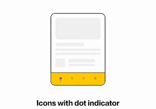
Icons with dot indicator
Adding a color fill to your icon is a great way to add some extra visual interest, and it can also help to indicate an active state. For example, you could try adding a dot to your icon to show that it's currently selected.
Take your Designing skills to Another Level with UI Design and UX Design Learn more
UI Design, UX Design, UI and UX Design, UI and UX Tips, Navigation Bars in UI Design, Navigation Bar, Figma


