Introduction
UI Elements are the core components of a user interface. They are the building blocks for creating a user interface. UI Elements can be used to create a wide variety of user interfaces, from simple single-page applications to complex multi-page web applications.
UI Elements are typically divided into three categories: Inputs, Outputs, and Containers.
Inputs are elements that allow users to input data, such as text fields, radio buttons, and checkboxes. Outputs are elements that show data, such as text blocks, labels, and images. Containers are elements that contain other elements, such as panels, accordions, and tabs.
The goal of UI design is to create user interfaces that are intuitive, easy to use, and visually appealing. UI designers use UI Elements to create user interfaces that are both functional and aesthetically pleasing. UI Elements can be used to create user interfaces that are both consistent and flexible.
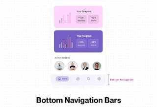
Bottom Navigation Bars
Bottom navigation bars are typically designed for three to five destinations. Each location is represented by a menu icon and it's title. When tapped, the user will be taken to the top-level menu item corresponding to that location on the app's main menu.Forms
Forms help users input sets of related information into the system and submit them. Think of all the boxes asking for shipping details when you order something online.Radio Button
Often confused with checkboxes, radio buttons are small circular elements that let users select one option among a list. The key here is noting that users can only choose one option and not multiple options like they can with checkboxes.Toast
Toast messages let users know that the task they just performed was successful. These messages give users immediate feedback after taking some action. Users don't need to dismiss toast messages, as they appear only for a moment before they disappear.Buttons
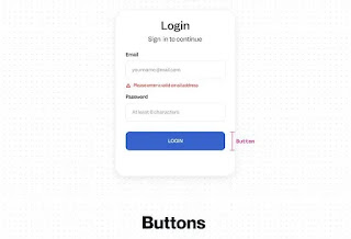
Buttons are one of the main UI Design components. They allow users to perform actions with a single click or tap-for example, submit, start, create new, etc. A button's role is to encourage users to act.Checkbox
In UI design, a checkbox appears exactly as the name suggests: a little square box on the screen that the user can check or uncheck. A checkbox allows users to select one of multiple options from a list, with each checkbox operating as an individual. Checking the checkbox marks it with a little tick!Pagination
Pagination is the process of dividing content across a series of pages. This is a popular and widely used technique for pagination web pages to split a list of articles or products into an easy-to-understand format.Tooltips
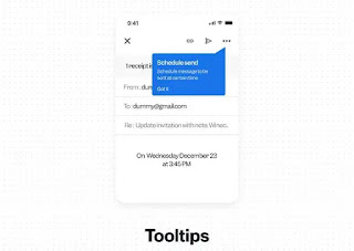
The tooltip, also known as info tip or hint, is a common Graphical User Interface (GUI) element in which, when hovering over a screen element or component, a text box displays information about that element, such as a description of a button's function, what an abbreviation stands for, or the exact absolute timestamp over a relative time.Take your Designing skills to Another Level with UI Design and UX Design Learn more
UI Design, UX Design, UI and UX Design, UI and UX Tips, Best UI elements for UI designer, UI elements for UI designer in Figma, Figma


