Introduction
Typography is a powerful tool for creating beautiful, effective designs in Figma. It can be used to create a variety of looks and styles, from classic to modern. In this tutorial, we’ll cover the basics of typography in Figma, including selecting typefaces, setting type sizes and line spacing, and more. By the end of this tutorial, you will have a better understanding of how to use typography to create impactful and eye-catching designs in Figma.
Paragraphs Size
If a line is too long the reader gradually begins to lose focus and can often have trouble reading from one line to the next. If a line is too short it causes the reader's eye to travel back too often, which disrupts their rhythm. This is why the optimal line length for body text is said to be around 40-75 characters per line.
Number Of Fonts
Services like Typekit and Google Fonts may give you access to thousands of fonts but it doesn't mean that you have to use them all. As you can see from the example, unless it's done really well, using multiple fonts can be very distracting. This is why usually recommend using no more than 2.
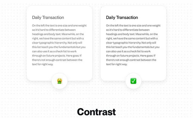
Contrast
Contrast is another aspect of typography that can affect readability. If there's not enough contrast between the text and the background, the content can become illegible.
Hierarchy
A typographic hierarchy can be established by using a variety of methods such as size, weight, color, and contrast. Its purpose is to give pages structure and guide the user through the content. Without a clear hierarchy the text becomes much harder to scan and therefore generally harder to read.
Text Alignment
The most common use case for this in UI design is with call to action text. In the majority of cases, however, text should be aligned to the left (if your audience reads from left to right). Left alignment helps the eye jump from one line to the next in a predictable way.
Body Text
Another important factor when it comes to your body text is legibility. Although a typeface like Satisfy might suit a design with a hand-made aesthetic, using a typeface such as this for your body text will have a negative impact on your users. This is because it's much harder to read than your average serif or sans-serif.
Whitespace
When rendering a layout with chunks of text, always consider your reader's ability to read. By adding enough whitespace around all four sides of a block of text gives it room to breathe and is therefore visually pleasing and easier to read. Make sure there is enough space in between lines, letters, and paragraphs.
Take your
Designing skills to
Another Level with
UI Design and
UX Design Learn more


